The beginning
I’ve been using the BBI mobile banking application for almost two years now. Before studying UX, I never thought this app needed any changes. Visually, yes-it looked outdated, like something from the early days of Android phones. But other than that, it got the job done.
Sometimes, it was hard to find certain options, and some actions felt repetitive. But who was I to make a change?
When I started studying UX design and looked back at the app, I couldn’t help but notice it needed some changes to make it simpler and more modern. So, I decided to redesign the application and see how it turned out. Join me on this journey as I walk you through the redesign process and share the results. Sit back any enjoy.
Original design
Let’s take a look at the original design, where I’ll discuss some UX concerns I had about it.
Homepage
When you open the homepage you get greeted by 12 options.
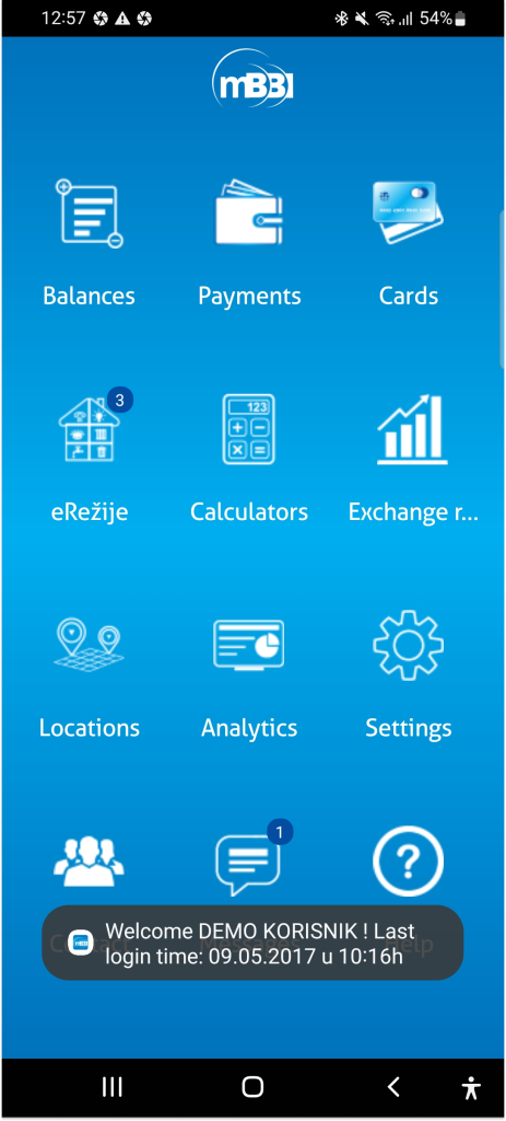
For some users this may not be a problem, but what about users who may not use technology daily, or what about NBU (next billion users) who started using technology recently. In those cases, bombarding users with 12 options at the start is too much. Instead, the focus will be navigated towards the most important features, which I will show later, as we go through the project.
Checking balance
The option to check your balance is the first one and quite obvious. When you click on it, you’ll see this screen:
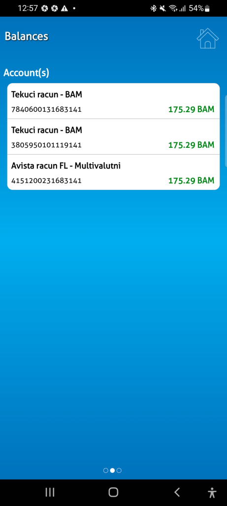
We see three accounts (depending on how many you have), along with the currency, account number, and current balance. Great.
After checking my balance, I want to go back. I look at the upper left corner, but there’s no option to return to the previous screen.
If we look at the upper right corner, we see a home icon that should take us to the homepage. Since we came from the homepage, it seems reasonable to use this icon to go back. However, it doesn’t work that way.
To maintain consistency in UX, we should follow familiar patterns from other applications, such as using an arrow pointing left to indicate that you can go back to the previous screen. Most applications use this arrow for that purpose. By using these familiar patterns, we reduce cognitive load and make simple actions more intuitive for users.
Now, an honest question for you, dear reader:
Have you noticed that this screen can be swiped left and right?
If you did, congratulations!
If not, don’t worry—it’s not your fault. The visual cue indicating that the screen can be swiped is not very noticeable.
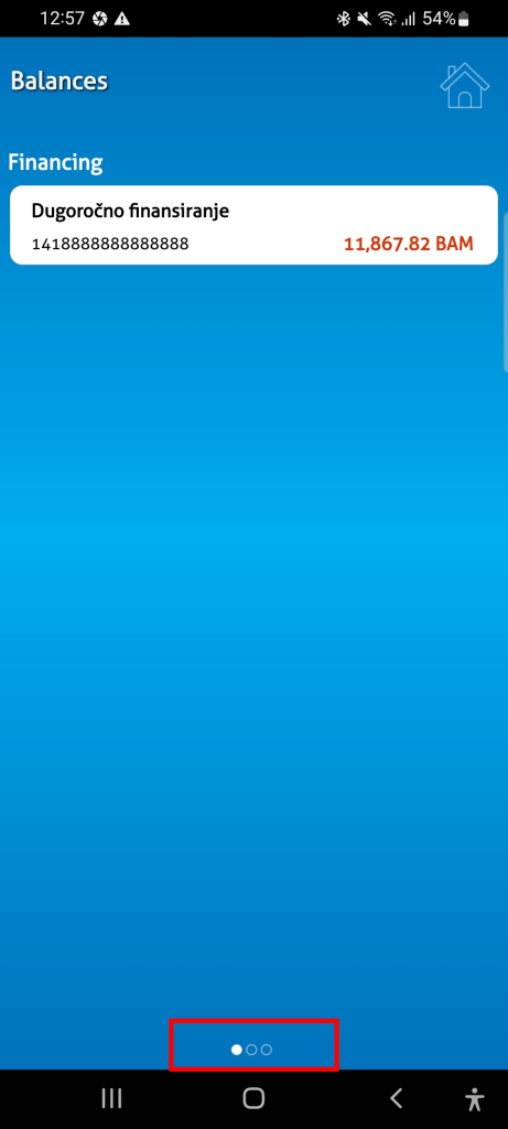
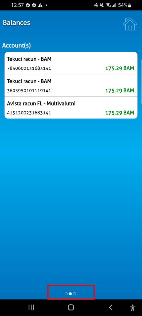
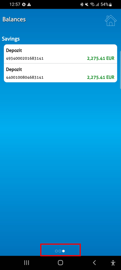
It’s located at the bottom and is quite small, which could cause issues for people with visual impairments.
Payments
Now, let’s look at payments. When you click on ‘Payments,’ you’ll see this:
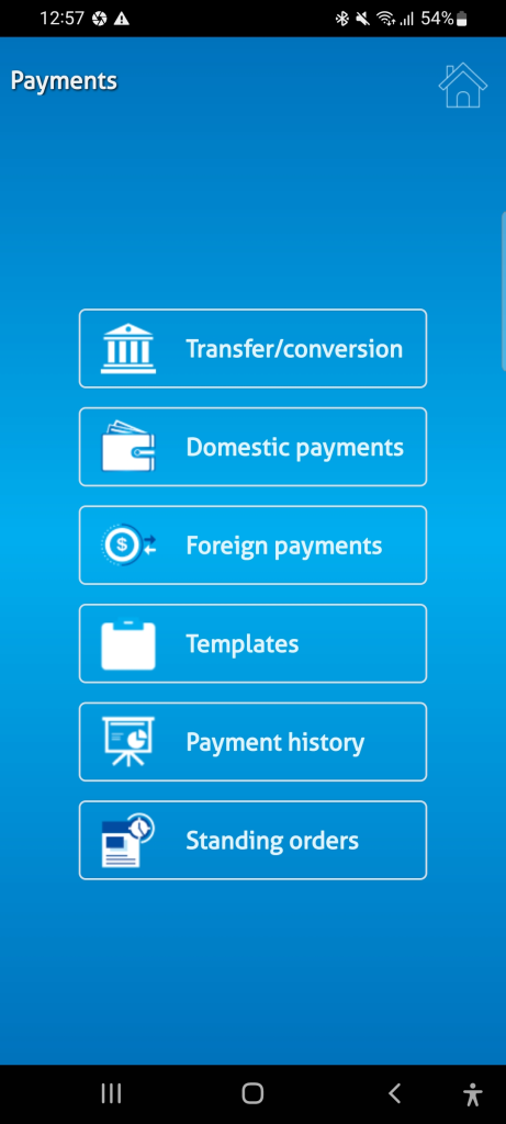
We have six options, arranged in order of importance. We’ll discuss the payment method in more detail as we go through the project. Instead of treating the entire payment process as separate steps, I suggest displaying all payment options on one screen. This would allow users to toggle or select between methods without having to go back. We’ll explore this idea further later in the project.
TRANSACTION HISTORY
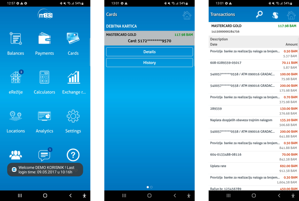
In the original app, checking your transaction history seems to be hidden.
To view your transaction history, you need to navigate to ‘Cards’ and then click ‘History.’ Here, you can see your transactions and filter them by date. Additionally, you can view a spending graph by clicking on an icon that might initially seem confusing. I was also surprised to find filter options under the search icon, as I expected to see a search bar for entering specific transfers
THE MOST IMPORTANT ACTIONS
You might be wondering, ‘What about the other features of the app? So far, we’ve only covered four.’ You’re right, but let me show you some data I’ve gathered from survey research.
The survey included the following questions:
- What is the main purpose when using your banking application?
- Apart from your primary use, what would you consider the second most important?
- In addition to the previous two actions/options, are there any more actions/options you would consider when using banking applications?
- When opening the app, should your balance be immediately visible on the homepage of the app.
The first three questions were open-ended. Some participants provided detailed answers, which were categorized into multiple groups.
Let’s see what were the results:
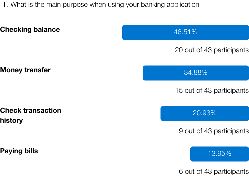
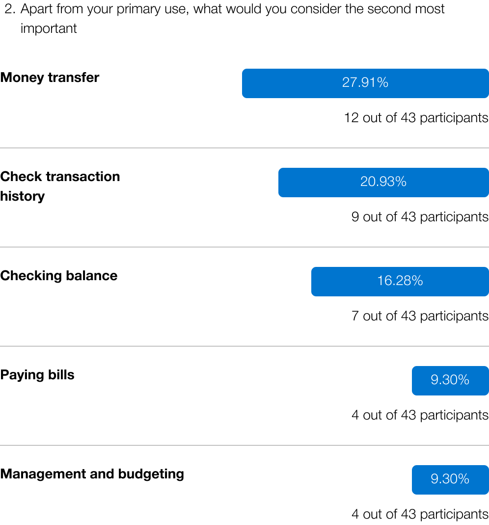
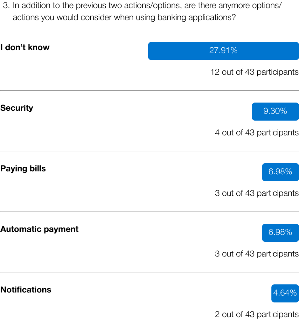
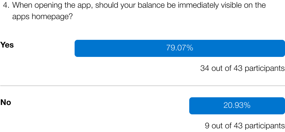
With this data, I’ve identified the three main actions to focus on.:
- Checking balance – combined 62.79% (27 out of 43 participants)
- Money transfer – combined 62.79% (27 out of 43 participants)
- Transaction history – combined 41.86% (18 out of 43 participants)
Users mostly preferred to see their balance as soon as they log into their banking application.
We’ve reviewed how these options and functions are currently implemented, so now let’s look at the first prototype.
The first prototype
CHECKING BALANCE
In the first prototype, after you enter your PIN and log into the application, you’re immediately greeted with your balance, rather than 12 options. From this screen, you can view all your accounts, see their balances, and click on any account for more details.
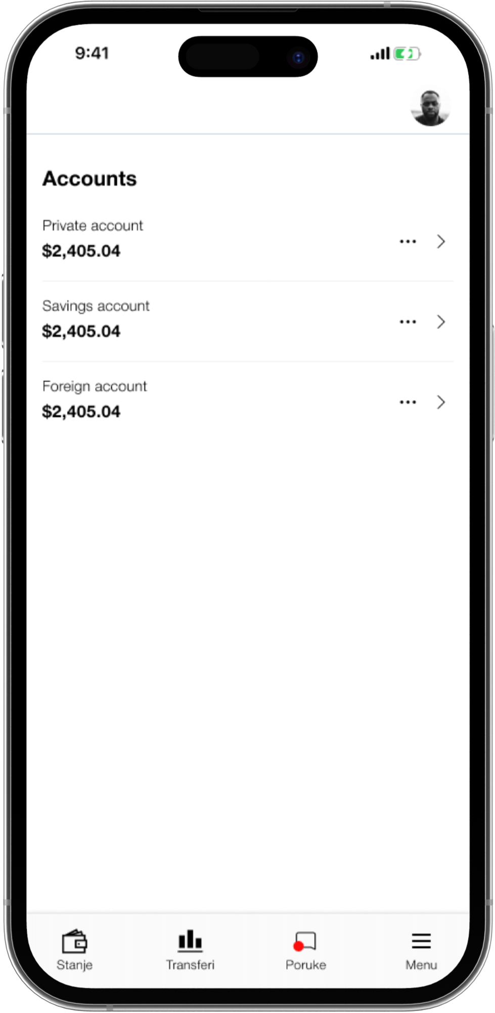
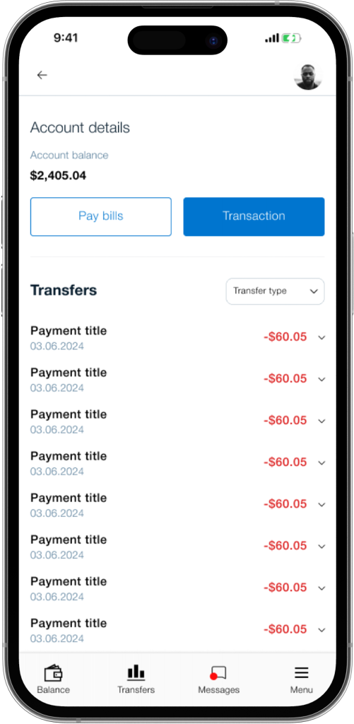
When you click on your account, you’re taken to the Account Details screen. Here, you can see your balance again, along with a primary call-to-action (CTA) for payments and a secondary CTA for paying bills.
Beneath that, you can see your transaction history.
PAYMENTS
As mentioned earlier, payments can be accessed from the Account Details screen.
But what happens when you click on them?
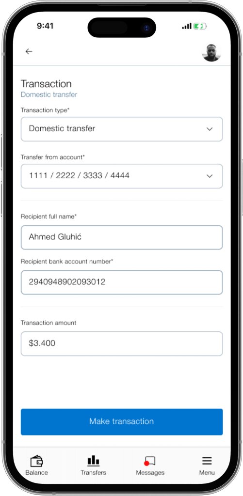
When you click on ‘Transactions,’ the main title at the upper left shows where you are in the app.
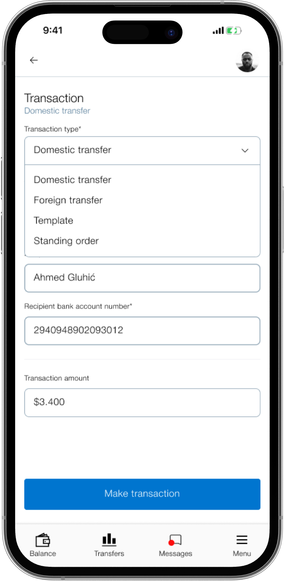
The first option allows you to select between multiple payment methods, eliminating the need to go back and choose a new one,
with everything available in one place.
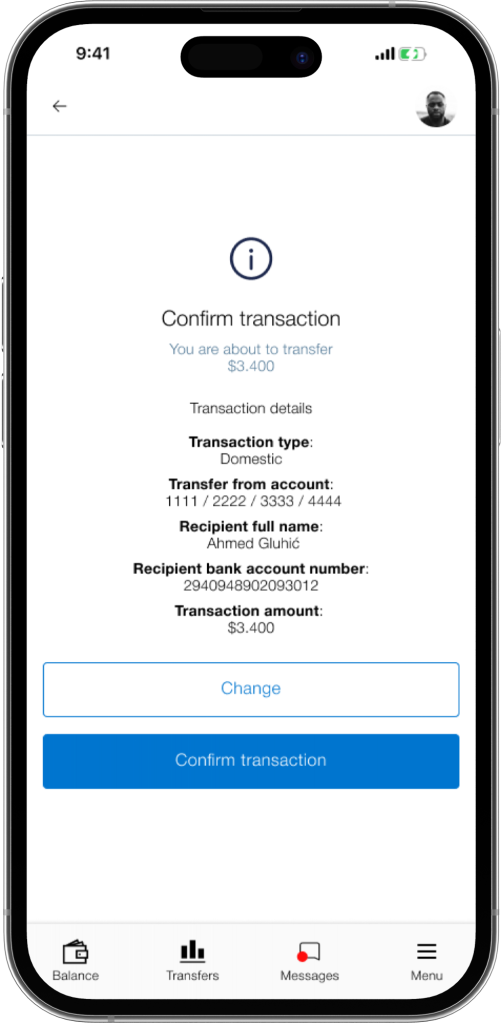
When we click on “Make transaction we get a confirmation screen:
TRANSACTION HISTORY
The data shows that checking transaction history is very important to users, so we need to make it easy to find.
By clicking on a specific account, you can view your transaction history without any additional clicks.

First usability study
After completing the most important actions and options, it was time to test them with other participants. I recruited five participants: two were users of the BBI application, two used different applications, and the last participant had never used a banking application
The main reason for recruiting two participants from different apps was to understand how they would adjust to using this app. The last participant was included to see how someone with no prior experience with similar apps would navigate and figure out the app
The participants were given three scenarios:
- When you open your app, please check how much balance do you have on your private account?
(Check balance) - You got a text from your mom. She told you that she needs 450 dollars to get some bills paid. How would you transfer 450 dollars to your mom?
(Money transaction) - You’ve recently spent a lot of money, but never had a overview of how much. How would you check your transaction history?
(Transaction history)
So, what were the results?
- 5 out of 5 participants managed to check their balance
- 4 out of 5 participants managed to make a transfer
- 5 out of 5 participants managed to check their transaction history
On the surface, this looks great, but one participant couldn’t complete a transfer. While the other participants were able to perform the task, their experience wasn’t smooth; there were pauses and random clicking as they figured out how to complete it. This raised some concerns, and changes need to be made. Before we continue, let’s look at some user feedback:
– Checking balance
- “It was a bit difficult to spot”
- “I had no issues”
- “It was easy”
- “For me it was simple”
- “Yes it’s easy, but I would increase the balance font size”
– Make a transfer
- “The option is hidden”
- “It was easy”
- “It seems intuitive, but I would add better design”
- “In comparison with the current app, this version is much better”
- “The process of transaction is very simple”
– Check transaction history
- “It was visible enough”
- “It’s intuitive, if I click on balance I see transaction history”
- “It’s logical to have it this way”
- “Very easy to find and see”
- “It has enough, to be intuitive”
After the usability study, I noticed some mistakes in the prototype. The most obvious issue was not including the filter options that were present in the original app, though users didn’t seem to notice. I considered whether to leave it out or redesign it to see if users would notice. I chose the second option, which will be shown shortly
The second mistake is quite straightforward. The data revealed three common patterns: ‘Balance,’ ‘Transfers,’ and ‘Transactions.’ However, in the first prototype, the bottom bar included the following:

I remember when going through the prototype I was confused why even put messages, why use this icon for transfers. So I redesigned the bottom bar:

In “Overview” you can view all of your accounts and balances, in “Transfer” you can access the transfer method and in “Transactions” you can view all of your transactions.
The second prototype
The second prototype includes several changes. Let’s review them together, starting with the new starting screen:
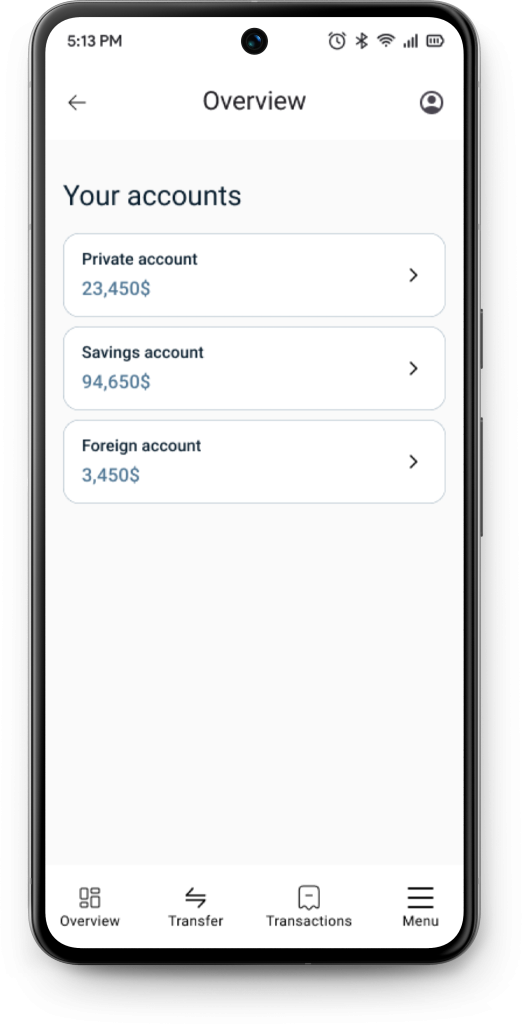
Each account now has its own container, making them stand out more compared to other accounts. The main background has also been changed to provide better contrast with other elements. When you click on a private account, you are taken to the Account Details screen.
On the Account Details screen, the title is displayed on the upper bar. We see a large title named ‘Private account,’ and from this screen, you can select other accounts without having to go back.
The font for the balance has been increased to make it more prominent. The two buttons or CTAs (call them what you like) now look more like actual buttons, unlike in the first prototype where they resembled construction bricks. Common icons have been added to help users recognize the functions of the buttons. Additionally, there are three dots for more options; when clicked, you can choose between ‘Card settings’ or ‘Deactivate card’ options.
I’ve also corrected my mistake, adding filters, making them more detailed with date, transaction type and payment type.
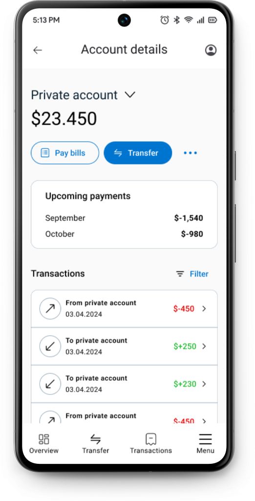
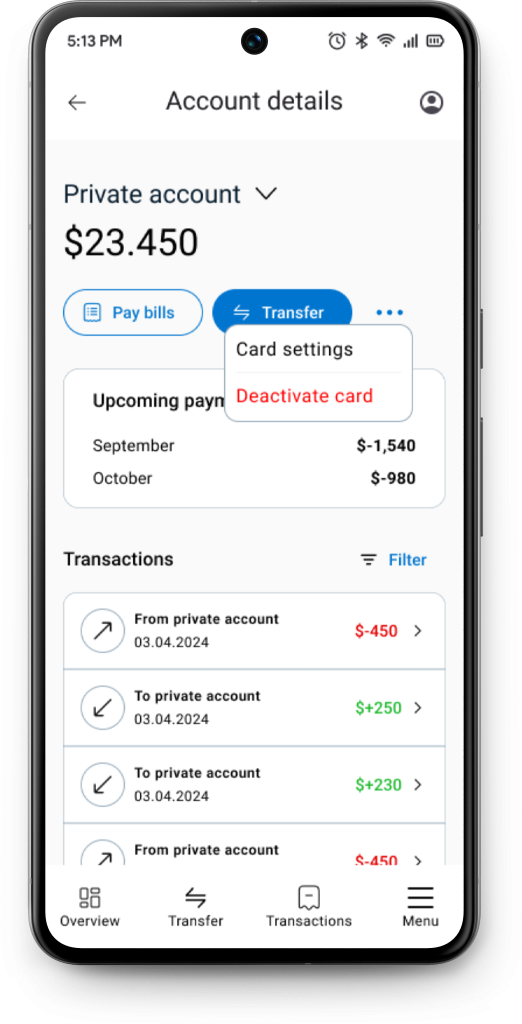
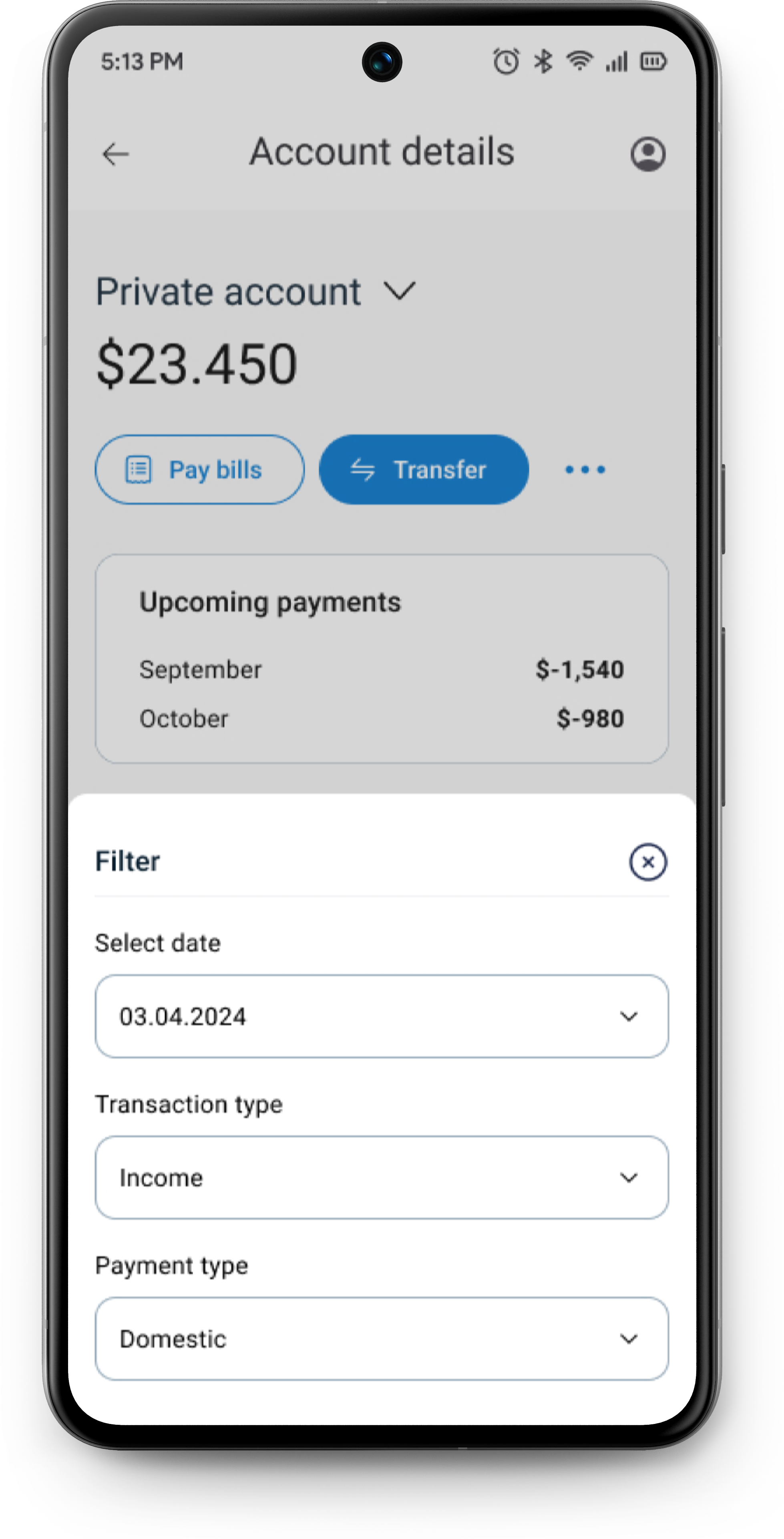
I’ve also added upcoming payments, as users would likely want to see how much money they can expect to spend alongside their transactions.
The transfer options have also been updated. During the redesign of the previous prototype, I was unsure which payment methods users preferred. So, I decided to conduct a quick survey to find out their preferences.
These were the results:
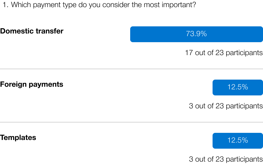
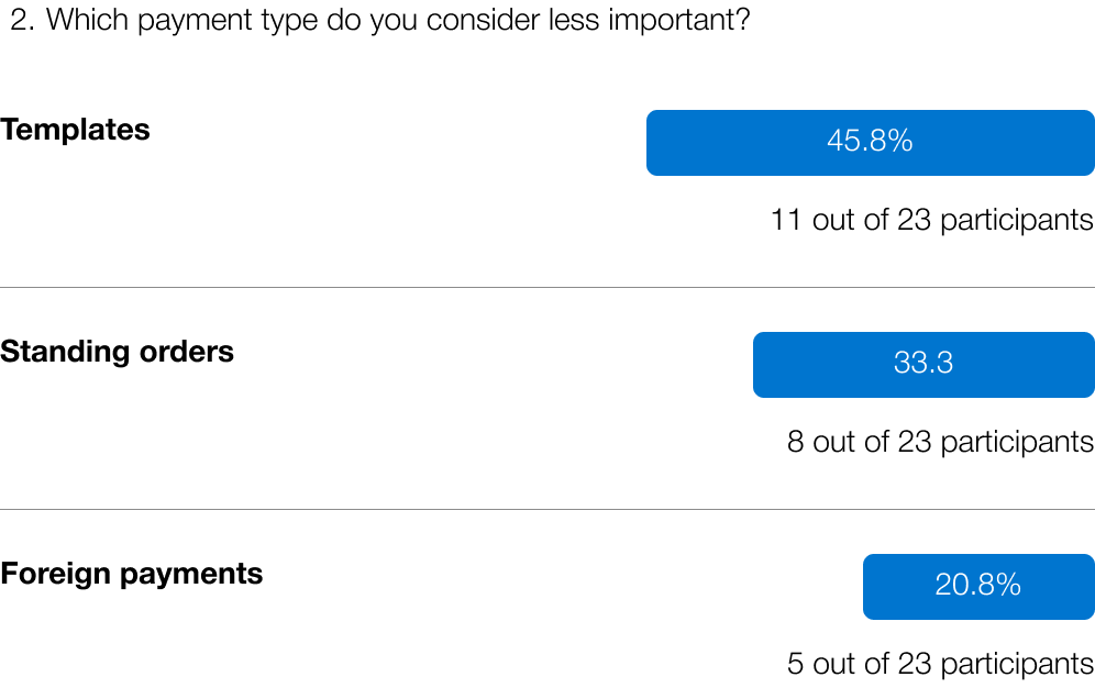
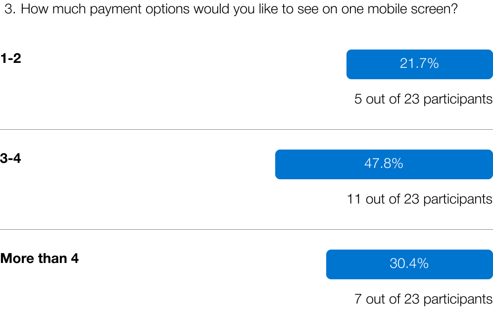
It’s clear that users mostly prefer domestic payments, with ‘Templates’ being the least important option. Users generally prefer having 3-4 payment options displayed on a single mobile screen. Based on this data, the following changes were made.
The most important payment option, ‘Domestic,’ is placed first, while ‘Foreign’ is second. Although ‘Foreign’ had similar responses to ‘Templates’ in the first question, it received fewer responses as a less important option in the second question, giving it more priority. Less frequently used payment options are accessible via the three dots, where users can select ‘Templates’ or ‘Standing orders.’ Now, users can access four payment methods from a single mobile screen.
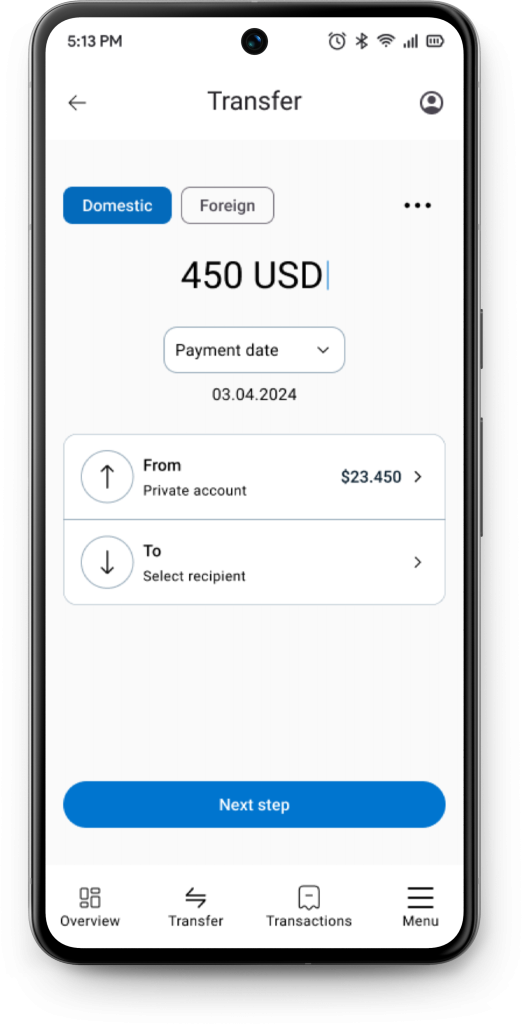
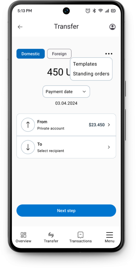
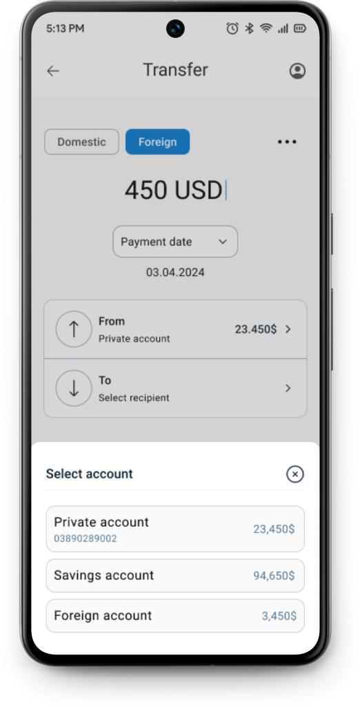
I’ve also aimed to simplify the payment process. If you want to make a transfer from a different account, instead of going back, you can click on the ‘From’ option and see the following screen:
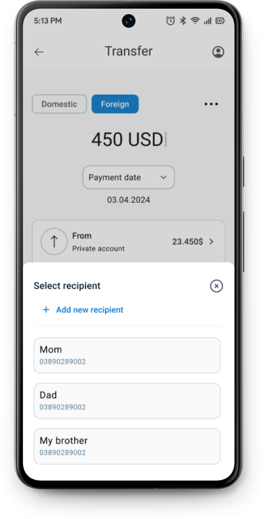
The same applies when selecting the recipient. Instead of repeatedly entering the recipient’s full name, bank account number, and SWIFT code for foreign transfers, you can create a recipient within the application. This way, you can simply select the recipient when making a transfer:
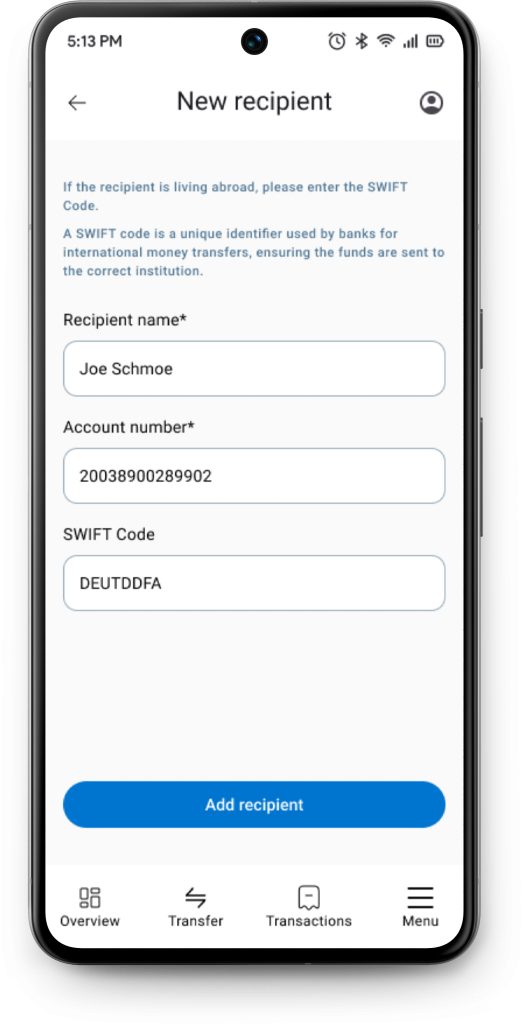
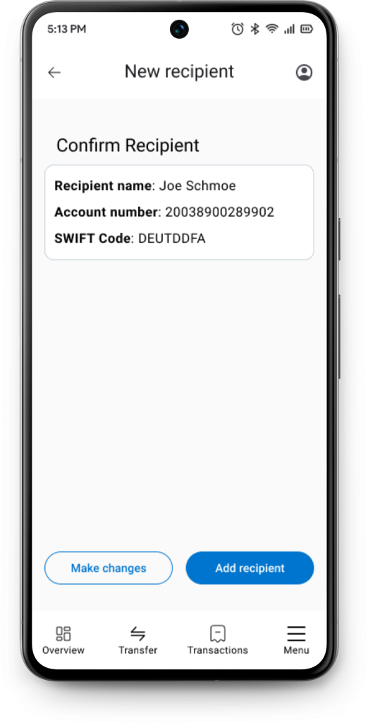
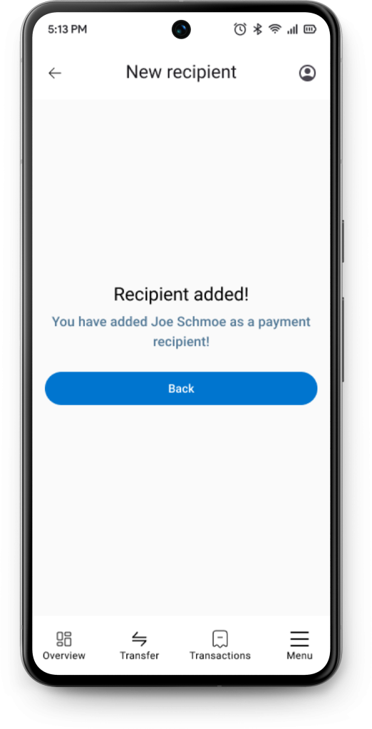
If you add a new recipient and select ‘Add recipient,’ you’ll first see a confirmation screen. After that, you’ll receive a final confirmation and can then return to the Payments screen.
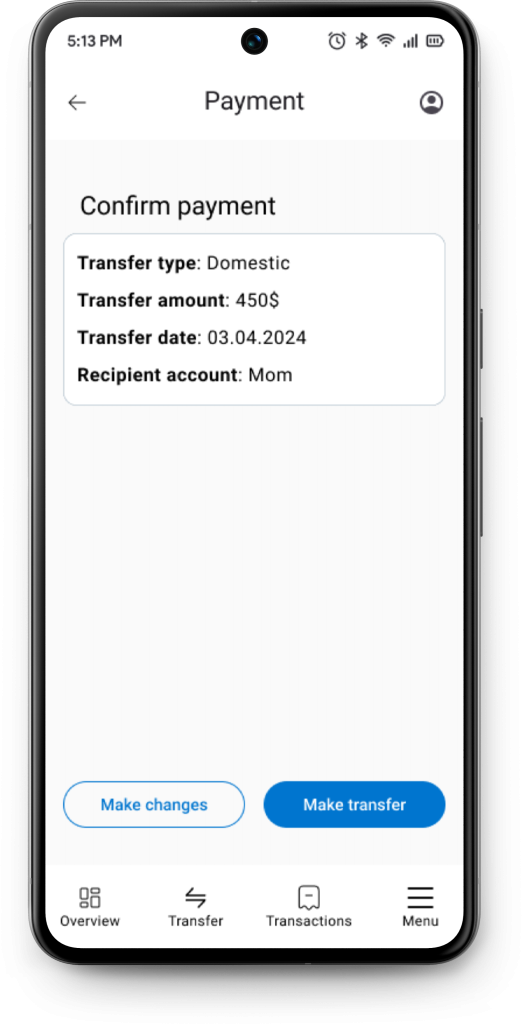
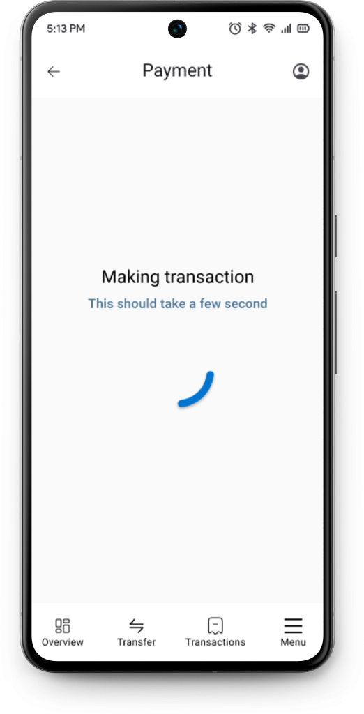
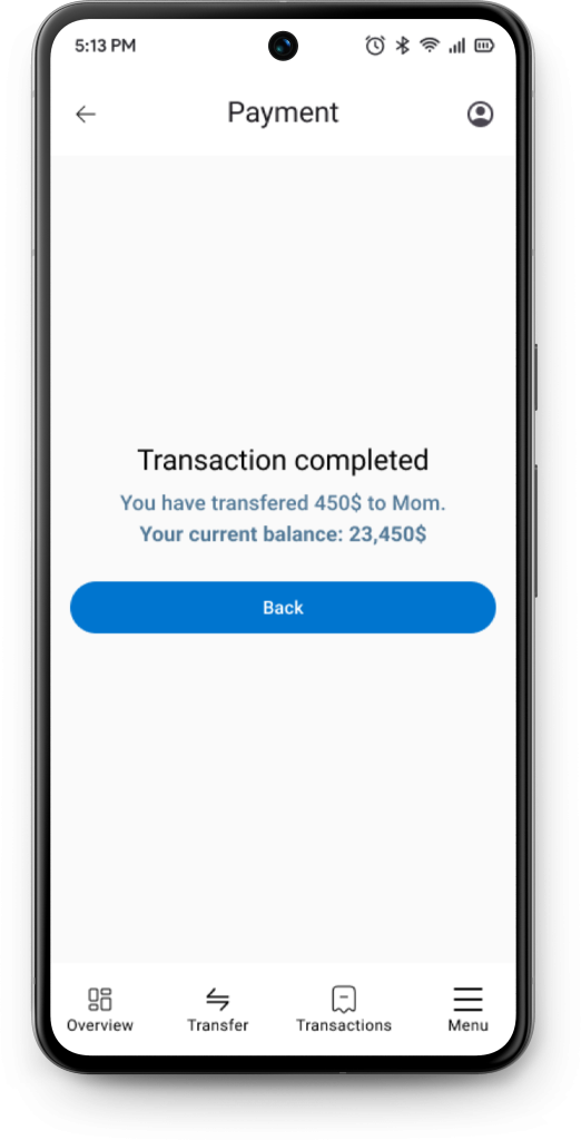
The payment flow is quite similar. You select the account from which you’re transferring funds, choose the recipient, and then receive a confirmation screen. After processing the transfer, which takes a few seconds, you get a final confirmation showing the amount transferred and the remaining balance in your account.
The second usability study
To test new changes, I’ve recruited 3 participants.
The participants were given the same scenarios as in the first usability study
- When you open your app, please check how much balance do you have on your private account?
(Check balance) - You got a text from your mom. She told you that she needs 450 dollars to get some bills paid. How would you transfer 450 dollars to your mom?
(Money transaction) - You’ve recently spent a lot of money, but never had a overview of how much. How would you check your transaction history?
(Transaction history)
And what were the results?
- 3 out of 3 participants managed to check their balance
- 3 out of 3 participants managed to make a transfer
- 3 out of 3 participants managed to check their transaction history
They provided feedback on the prototype, with the most common concern being the hierarchy of accounts. Two out of three participants felt that the private account was not clearly distinguished from the others, as they had to scan through all accounts to identify their private account. They also expected the entire container to be clickable, not just the arrow.
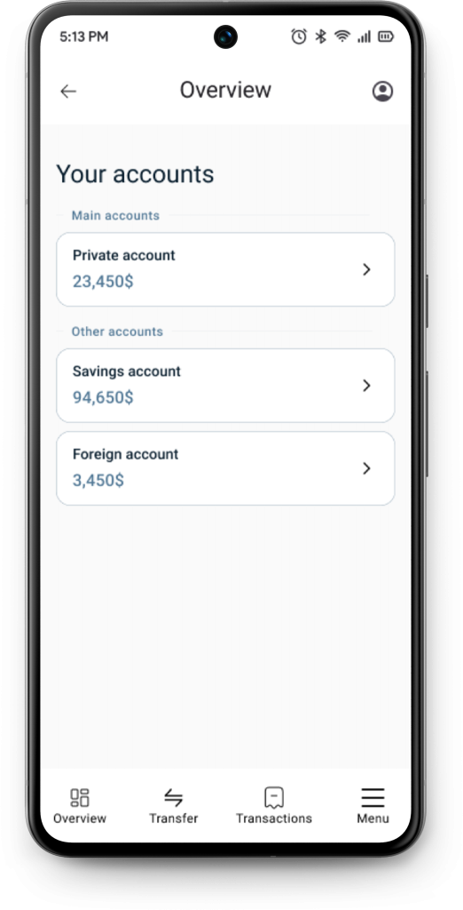
Accounts are now separated into two categories: Main and Other accounts. The private account is placed under Main accounts, making it more prominent compared to Savings and Foreign accounts, which are listed under Other accounts. Additionally, the entire container is now clickable, making it easier to access Account Details
What have I learned from this project?
I’ve been working on this project for a month, and one key lesson I’ve learned is to trust the process. At various stages, I rushed parts of the project because I was eager to post it and show everyone what I’d done. It was a tough balancing act between ‘Hurry up and post it soon’ and ‘Take your time and make a good project.
The first thing I’ve learned is not to rush surveys. Even though I have an article about how to conduct surveys, I went against my own advice in an effort to post this as soon as possible. So, what was the mistake?
My survey included three open-ended questions. While this isn’t a major mistake, open-ended questions are generally better suited for user interviews. I chose this approach because it was difficult to find participants for interviews at the time, so I decided to include these questions in the survey. Although I received enough responses and summarized the data, doing it the correct way would have been much easier.
It would have been better to start with a few user interviews and ask participants questions related to mobile banking applications, such as, ‘What do you consider the main purpose of using your mobile banking app?’ For example, if participants mentioned ‘Paying bills,’ ‘Making transfers,’ or ‘Checking balance,’ I could then use these responses in a survey question like, ‘Which option do you consider the most important?’ and list the previously mentioned options.
As a junior working on my first major portfolio project, I’ve learned to truly respect the UX craft. It seemed easy at first, but the complexity became clear once the real work began.
The conclusion
The project has shown good results in both usability studies. In the first study, all 5 participants were able to check their balance and transaction history, and 4 out of 5 managed to make a transfer. In the second study, all 3 participants could check their balance, make a transfer, and view their transaction history without problems.
These results show that the main features of the app are working well and users find them useful.
Leave a Reply