About the project
I got hired by WorkPoint365, helping them with their product WorkPoint Express.
WPE (WorkPoint Express) is a ground-breaking solution designed to tackle challenges associated with traditional email
and attachment management in Outlook.
WPE enables you to store, manage, and collaborate on both emails and attachments, ensuring they are readily accessible and no longer
trapped in a user’s inbox.
What was the problem?
Since Outlook was updated, the current WorkPoint Express version has not been compatible
with the current version of Outlook, because it was built upon old technologies like COM and VSTO.
WorkPoint365 has now decided to have a new update developed using modern technologies and a more modern
user interface (UI), thus needing to test the usability of the new design.
My role
My role in the project was working as a Junior UX Researcher, taking responsibility for the moderated
usability studies.
The plan
Since a UI design was already done, to make the entire UX process easy for the team to understand I created
a UX delivery process:
- Kick-off
> Create Figma files
> Create a UX repository - Understand
> Collect data about WorkPoint Express
> Analyze the data
> Consult with stakeholders - Prepare
> Pick use cases for testing
> Prepare materials for product review
> Pilot testing - Recruit
> Get leads
> Get confirmation
> Schedule testing sessions - Test
> Conduct moderated usability tests
> Gather and analyze data
> Present findings to stakeholders (usability report)
Use cases for testing
After gaining an understanding of the product, it was time to focus on specific use cases, that needed to be tested:
> Save an email
> Save email attachments
> Create a new document
> Move a document
> Rename a document
Generate questions for participants
To have some questions for participants, I’ve organized a brainstorming session with some
team members and stakeholders, to come up with some questions.
The main reason for this was to have questions from different perspectives because a
designer a developer or any other profession will always have a different type of
questions for a user. We focused on that questions stay relevant to the solution we are
working on
> Have you ever used WPE (WorkPoint Express) before?
> How would you describe your job?
> What do you think makes a good product? Functionality, look and feel, or something else?
> Do you find it easy to adapt to new technologies?
> How many years of experience do you have regarding Microsoft 365?
> How often are you using Microsoft 365 products?
> Has WPE been a useful add-in for you in Outlook, if yes could you describe why?
The questions were used so that before the usability test, I had a conversation
Pilot testing
After the use cases and questions were ready, I had to make sure how the test would go.
So I had pilot sessions with two team members who gave valuable feedback about some parts of
the sessions that could be improved, which made upcoming sessions easier.
Recruit participants
Now I had to find participants. Luckily for me, one of the stakeholders helped me a lot with this
step, making a survey, where other team members would accept to participate, so from that
point I would just reach out and schedule a meeting.
The test
The test was conducted with 12 participants, some who use it every day, some who use it once or twice
per week and some who used it before, but stopped using it.
The sessions lasted from 40 to 60 minutes.
To know if someone completed a task, I followed the rule:
“The participant was not being blocked doing the process, which required
support of the moderator to continue”
Success rates

Some findings:
> Participants had a hard time locating the save e-mail icon
> The icon for saving emails was confusing
> They’ve noticed the lack of the quick access icon for
saving email attachments
> The whole process of saving attachments was an overkill
for some participants
> Creating a new document option was not obvious
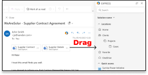
> Participants tried to drag and drop when saving attachments.
The main issue
The most obvious one was the saving attachments. Users are used to just drag and drop to save them,
but in this version that was not possible.

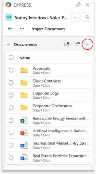
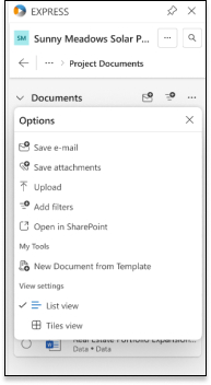
These are the steps the user needs to do, to save attachments:


Recommendations
When it comes to the save attachments issue, the users were already used to one
behavior and my focus was on behavior change strategies, like Nir Eyal’s Hook Model:

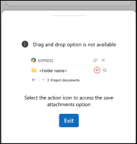
So when the user tried to drag and drop, he would get a visual cue, something like this:

The visual cue is the trigger that prompts the user to take action. Remember that this was
just a recommendation, designed in a way to explain how actually to save
From the trigger, we navigate to action, where the user can click on the quick access icon
of saving attachments:

When the user saves attachments if we follow Nir Eyal’s hook model, the next
step would be a variable reward. In this case, it would be a sense of satisfaction
in completing a task, especially in this situation where this is a
new behavior and users don’t have issues completing the task.
Yet again I would like to remind you that this is just a recommendation, and I just wanted to showcase my way of design thinking.
Conclusion
The usability testing for WorkPoint Express identified significant user challenges, particularly with saving attachments. Users expected a drag-and-drop functionality, which the current version did not support. By focusing on aligning the product with user habits and introducing behavior change strategies, I recommended implementing visual cues and quick access icons to facilitate a smoother user experience. These changes, if adopted, are expected to enhance user satisfaction and streamline workflow processes, making WorkPoint Express more intuitive and efficient for users.
Implementing these recommendations will address the primary pain points identified during the usability tests, leading to a more user-friendly product that meets the evolving needs of its users.
.

Leave a Reply