Redesigning Kirppu’s item management, showroom, and booking experience
Outcome
I was responsible for redesigning the booking flow and the new Showroom experience.
My main focus was to:
- Make the recommended 2-week rental the clear and preferred choice and Make online listing the default option (with clear consequences when turned off) helping the business by nudging users towards these two actions.
- Design a simple category → subcategory → item discovery path for the Showroom
- Keep the visual style consistent with the main website (no border radius, simple design)
WHO: Kirppu / MyKirppu / Showroom / Booking flow
WHAT: UX design for item management, Showroom, and booking flow
RESULT: Redesigned the core flows to reduce confusion and friction when managing items, making bookings and browsing items.
Project summary
I redesigned Kirppu’s item management, sales, and booking experience, and created a new feature called the Showroom. An online platform that lets customers view items sold at local stands within the Kirppu ecosystem. The goal was to make the existing flows clearer and more efficient while introducing a new way for customers to discover items.
Problem statement
Kirppu needed a redesign of their existing item management, sales, and booking flows, as well as a new Showroom feature. Stakeholders highlighted that MyKirppu is used by both staff and customers of all ages, with special attention needed for older users. They also stressed that the Showroom was crucial, and that the booking flow should help users choose stands that generate revenue for the business while still delivering value to the renters.
User and needs
Kirppu is Denmark’s largest chain of indoor flea markets, where people rent stands to sell second-hand items and customers come to buy them. MyKirppu is used by both stand holders and Kirppu staff. The goal of the project was to optimize the UX for MyKirppu, the booking flow, and the new Showroom experience, while keeping the design simple and accessible for users of all ages.
My role in the project
I joined Kirppu as a UX consultant. I worked closely with the CTO on the requirements for the new Showroom and collaborated with a developer to ensure the designs were feasible. To support development, I created a design system and detailed documentation. I also worked with the marketing manager to gather user insights (as there were no resources for formal research) and with the brand/graphic designer to align on colors, fonts, and brand guidelines.
The mandate
MyKirppu
One of the main requirements from stakeholders was to redesign the existing MyKirppu platform and its flow.
MyKirppu is the tool used by both Kirppu staff and customers to manage their items.
One of the main requirements from stakeholders was to redesign the existing MyKirppu platform and its flow.
MyKirppu is the tool used by both Kirppu staff and customers to manage their items. The platform included the following key features:
Item creation
Select all items
Item actions
Item in store
Order labels
Edit items
Trash
View more
Item on discount
Delete item
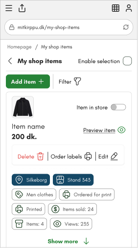
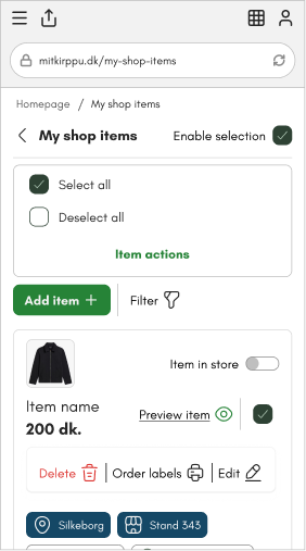
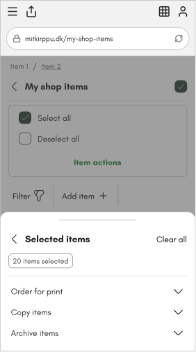
Starting screen
We made sure that all the most important actions were directly available on the starting screen, so users didn’t have to dig deeper to find them.
Multiple item selection & actions
Based on stakeholder feedback, we also improved the selection experience. Users can now:
Enable selection to select all items at once
Deselect all items when needed
Still keep the checkboxes visible, so they can easily select only the specific items they want to take action on
These changes made it faster and clearer for users to manage both single and multiple items.
Showroom
The Showroom was a brand-new digital surface with more than 400,000 items from the physical stores. Stakeholders expected heavy use of the “find a specific item” flow and needed it to feel fast and obvious for customers.
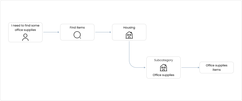
Together with the CTO I focused on the category → subcategory → item path, because it was the highest-priority interaction for the launch.
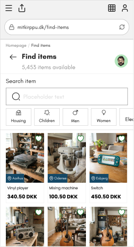
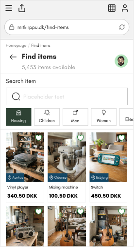
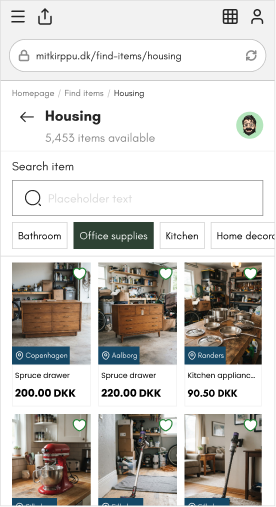
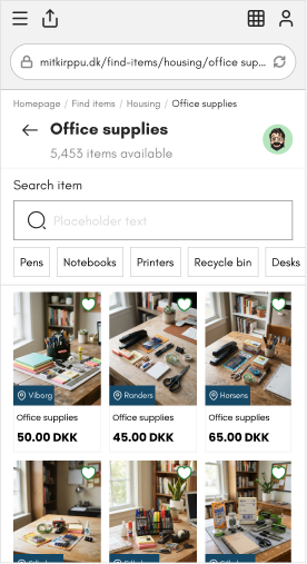
A user looking for office supplies would:
Start on the “Find items” screen
Choose the Home category
Open the Office supplies subcategory
Select the exact item they wanted
The goal was simple: remove friction so people could go from “I need this” to “I found it” without getting lost in the large inventory.
The Booking flow and MyKirppu used one design language. The Showroom needed a different approach.
Because it lived closer to the main Kirppu website, we aligned it fully with the site’s visual style — simple, clean, and with no border radius on elements. This kept the experience consistent and avoided introducing a new look that would feel disconnected from the rest of the platform.
Booking flow
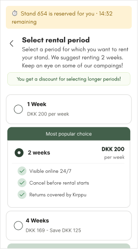
The booking flow already existed in the Kirppu ecosystem, but it needed a clear redesign. Stakeholders wanted the experience to feel simple while guiding users toward two business-critical choices:
Selecting the 2-week rental (the recommended option)
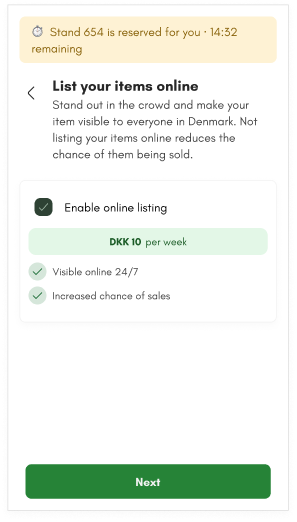
Enabling online listing of their items
Here’s how we approached it:
Nudging users to the 2-week option
The 2-week rental was visually highlighted and presented as the clear recommendation. All the benefits and features that come with that specific period were shown upfront, making it feel like the natural and most complete choice.
Making online listing the default
At the end of the flow, users landed on a “List your items online” screen.
Online listing was enabled by default
The weekly price was clearly shown
If a user turned the option off, we strongly emphasized what they would miss by not listing online
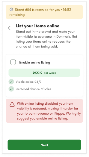
The goal was straightforward: show that enabling online listing benefits the user (more visibility and sales potential) while also serving the business. Both outcomes were treated as equally important and designed to feel helpful rather than pushy.