What makes a design good?

Ahmed Gluhić
UX Researcher & Designer
We have all asked that simple question: “What makes a design good?”
In today's UX world, the answer is often heavily focused on visual design. And while aesthetics certainly matter, a visually appealing interface can create the aesthetic-usability effect—the tendency for users to perceive something as easier to use simply because it looks good.
From my experience, relying on aesthetics alone is rarely the desired outcome. A beautiful interface can still be confusing, difficult to navigate, or frustrating to use.
So what actually makes a design easier to understand and use?
In this article, we'll explore five psychological concepts that can help build discoverability and make interfaces easier for users to understand and interact with.
What do we focus on then?
Instead of putting all of our efforts in aesthetics, there are five proven psychological concepts that Don Norman highlighted in his book "Design of Everyday things." We will cover all of them, and by the end of this post you will have a clearer guideline on what makes a good design good.
A good design is combined made from discoverability and understanding. Discoverability is founded on the five psychological concepts:
Affordances
Signifiers
Constraints
Mapping
Feedback
1. Affordances
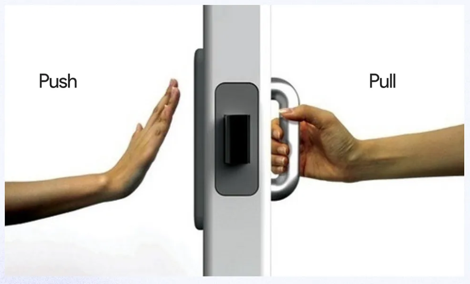
We can view affordances as a relationship between the object and the capabilities of the user. To better explain it let's view the following example:
"Imagine a chair. A chair affords sitting, but it can also afford other actions, such as lifting or moving. However, whether the action is affordable depends on the capabilities of the user. An adult will maybe easily lift the chair, while a small child or an elderly person may find it too heavy. In that case, the chair affords lifting for one person but not necessarily the other."
This why we view affordances as important in design. The object on it's own doesn't simply afford an action on it's own. The affordable actions depend solely on the user's capabilities.
How can we view it for a digital product?
"Let's imagine we have a finance dashboard. The dashboard provides actions such as making payments, managing expenses, and canceling subscriptions. We have two users. The first user has a good understanding of personal finance. They can easily understand what different options mean and how to use them. The dashboard affords these actions to the user.
The second user also wants to manage their finances, but they have little knowledge of financial terminology. The same options may be confusing or difficult to understand. The actions still exists within the interface, but the user's knowledge and abilities make those affordances harder to perceive and act upon."
An action can be available in the interface, but I doesn't always seem obvious or usable to every user. How do we help the second user?
Do we need to keep adding buttons, feedback or visual elements to make every possible action clear? Or, is there another psychological concept that can help us make these actions more discoverable? This brings us to our second concept, Signifiers!
2. Signifier
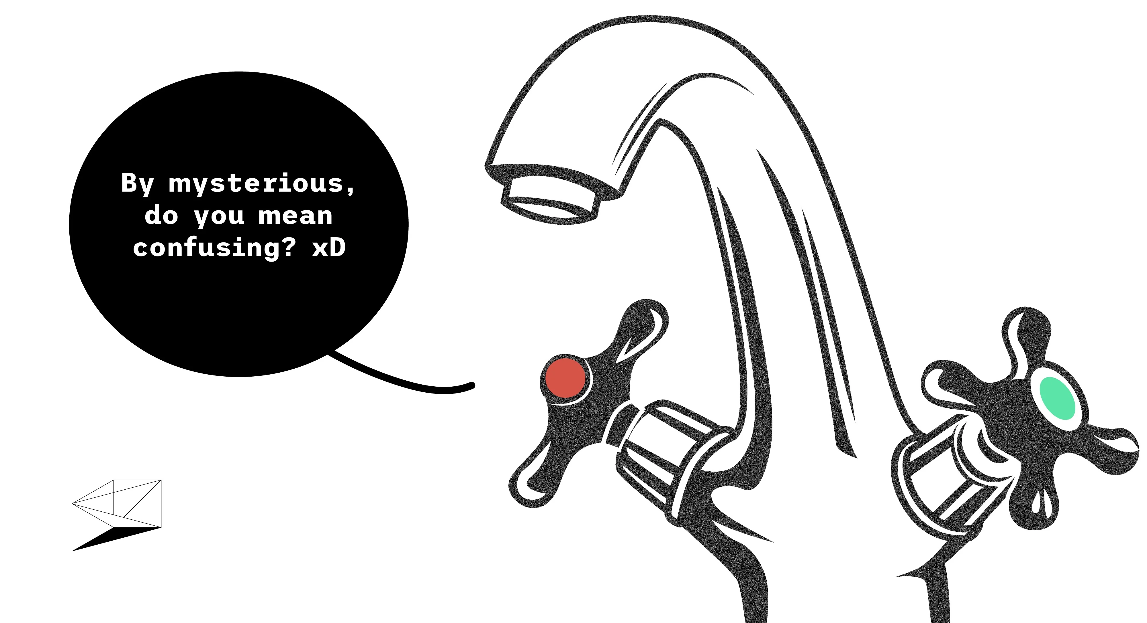
We can view signifiers as any type of cue that communicates where an action is possible or how to perform it. They are like GPS navigation through the design journey, guiding users toward the actions they want to take.
Need to pay your bills? Follow the obvious button that says "Pay your bills."
The button doesn't just perform the action, it communicates that the action is available and tells the user where to complete it.
How do we implement signifiers in our imaginary dashboard?
Let's return to the actions we mentioned earlier:
Making payments
Managing expenses
Canceling subscriptions
We can consider all three as important actions, but we shouldn't make every button look the same. If we make every action a primary button, everything will compete for the user's attention and the interface can become confusing. We need to prioritize the actions. But how do we know which should be more important?
We have two options:
Look at competitors: We can check how other financial products handle similar actions. This is the faster option and can give us a good starting point.
User research: We can talk to users and learn what they actually want to do with the dashboard. This can help us understand which actions are more important to them.
Let's say that based of our research we have learned users have prioritized "Making payments" as the most important action, "Managing expenses" is the second most important and "Canceling subscriptions" is the third.
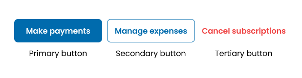
Now we have a clear understanding of what's most important to users and we can use that knowledge to implement better signifiers.
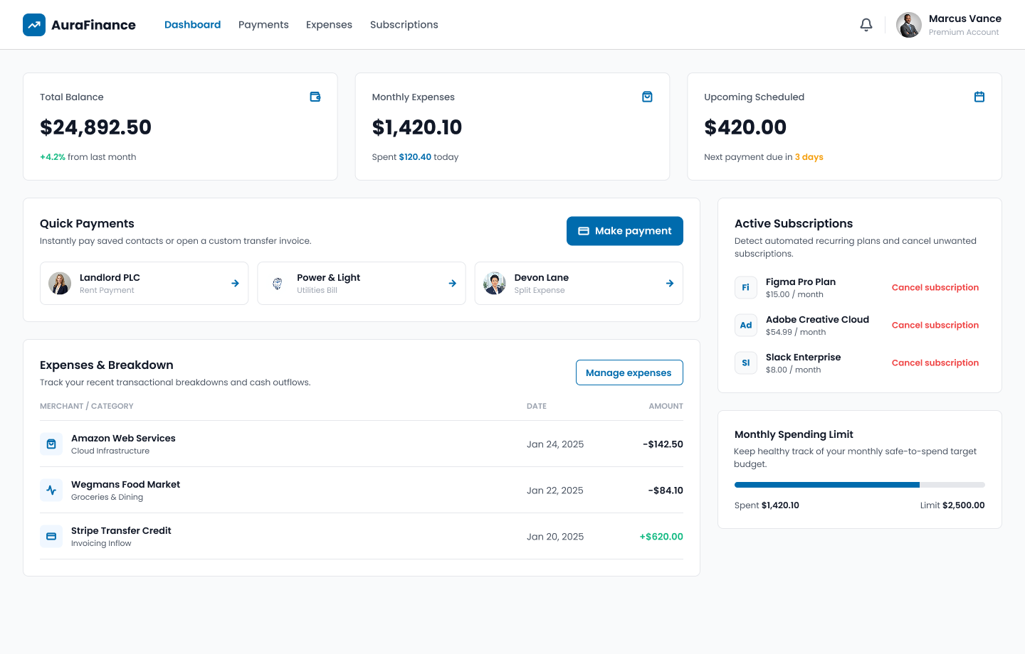
(AI generated UI example)
Now, when the user enters the financial dashboard, they don't have to figure out where to find the actions they need. The signifiers clearly show where an action can be taken and what will happen when they do it.
Take a look at the "Cancel" action. Notice that it is red. This is another signifier based on a common design convention: red is often associated with danger, deletion, or actions that may be difficult to undo. Because users are already familiar with this convention, the red button gives them an additional warning before they take the action.
But what happens when we want to limit user's actions or prevent them of performing certain actions at all.
This is where our next psychological concept comes in, Constraints.
3. Constraints
Instead of simply telling users what they can do, constraints help prevent them from doing they shouldn't. We have four types of constraints:
Physical
Cultural
Logical
Semantic
Let's see how can we implement them within the finance dashboard.
1. PHYSICAL CONSTRAINT
For physical as stated we want to prevent an unnecessary action. Let's view the following example.
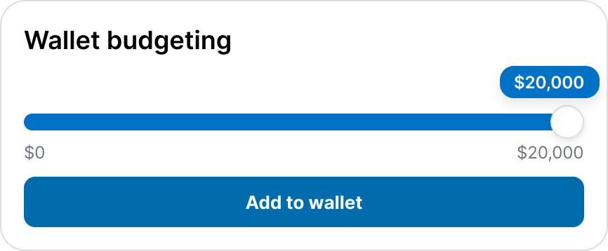
In this example, we have set a maximum budget of $20,000 for the user's digital wallet. The seller cannot move beyond the value. By limiting the slider's range, we prevent the user from setting a budget higher than $20,000. The interface physically limits the possible values the user can select.
2. CULTURAL CONSTRAINT
They are cultural constrains based on learned conventions, patterns that users have learned from their culture and previous experiences.
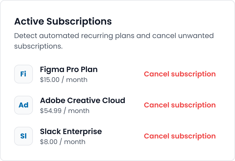
In this example, we can see that “Cancel subscription” is displayed in red. As we mentioned earlier, red is commonly used as a design convention to communicate danger or potentially destructive actions. The interface doesn't need to explain that red means danger every time. Users have already learned this convention through their previous experiences with digital products. This allows them to understand the meaning and potential risk of the action more quickly.
3. LOGICAL CONSTRAINT
Logical are based on reasoning or process logic.
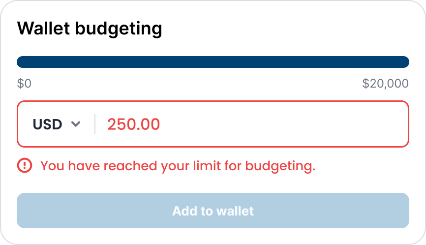
In this example, the user has reached the maximum limit for their wallet budget. Once the limit is reached, the “Add to wallet” button becomes disabled.
The input also displays an error message: “You have reached your limit for budgeting.”
The disabled button acts as a logical constraint because the system prevents the user from performing an action that is no longer possible. The error message then provides feedback and explains why the action is unavailable.
4. SEMANTIC CONSTRAINT
They are meaning based and they rely on the meaning of the situation or object.
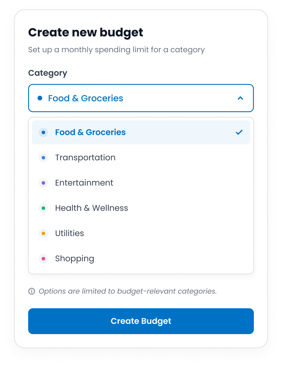
In this example, the user is creating a new budget. The interface asks them to choose a category, such as Food, Transportation, or Entertainment.
The available options are based on the meaning of the task. For example, the user wouldn't expect to find an option such as “Password” or “Profile Picture” when creating a budget category.
This is a semantic constraint. The meaning and context of the task help determine which actions or options make sense to the user.
What happens if the action is possible and we need to make it clear how the interface control something? This brings us to our next concept.
4. Mapping
Mapping is how naturally a control matches it's effect. When the mapping is good, users can easily understand what will happen when they interact with something.
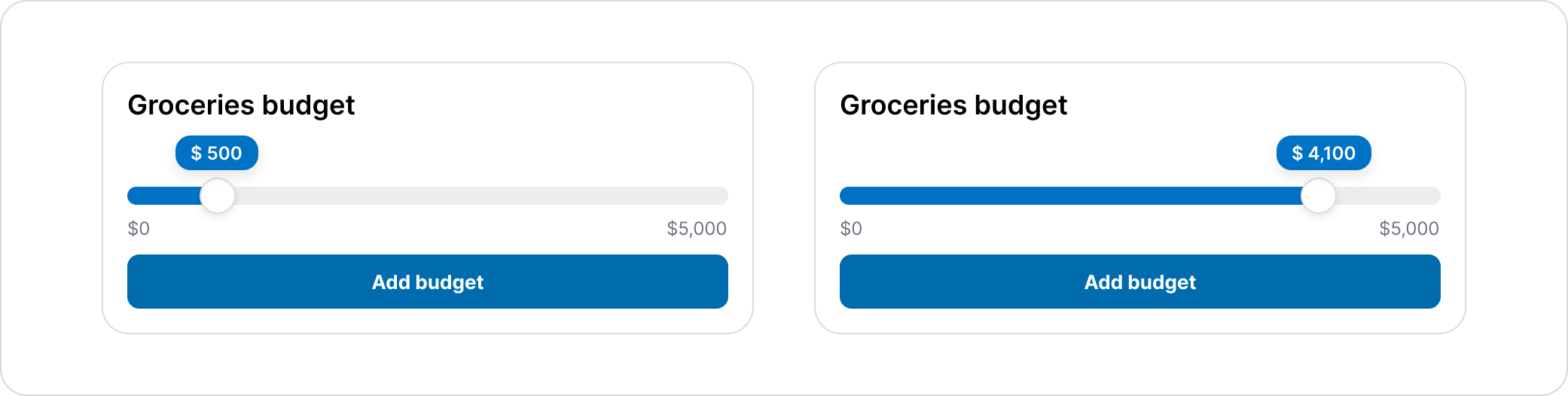
In this example, we have an option that set our grocery budget. We have a slider that goes from $0 to $5,000. As the slider moves to the right, the value increases. If we move it to the left, the value decreases.
This is good mapping, because the relationship between the control and the result is clear. Moving the slider right increases the value. Moving it left, decreases the value. The user doesn't need to guess what the control will do.
Another great real-life example is a car's steering wheel. When you turn the steering wheel to the right, the car turns right. When you turn it to the left, the car turns left. The control and the results match what the user expects.
With good mapping, the relationship between a control and it's result should be clear and match the user expectations.
The last and maybe the most important thing that makes a design good is feedback.
5. Feedback
In todays digital systems, feedback is often missing, or doesn't communicate enough information. Good feedback is informative, on time and clear. Users should immediately understand that their action has been recognized and when necessary, what is happening next.
Even a small delay without any feedback can make users wonder whether their action was registered. They might click on the button again, refresh the page, repeat the action, which all leads to confusion.
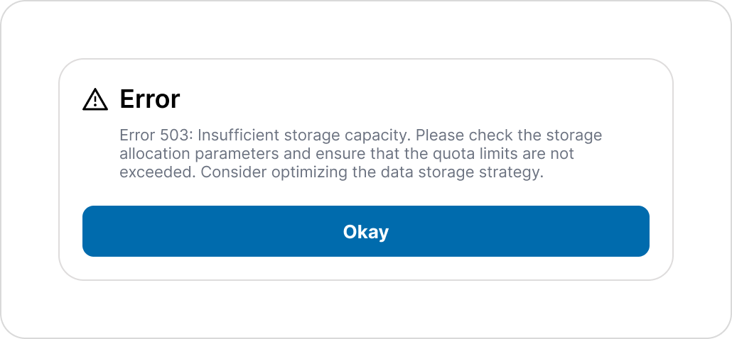
In this example, we receive feedback telling us that an error has occurred. However this is not good feedback. The message uses technical language that the user may not understand. Instead of explaining the problem in simple, user-friendly language. It also doesn't communicate well what the user should do to fix this issue.
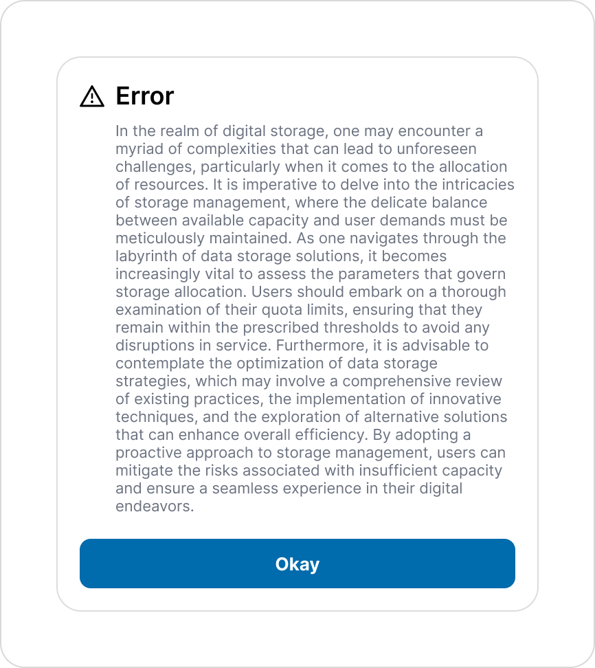
In the second example, we have something we can call the "backseat driver". Imagine you're driving a car and you're friend is sitting in the passenger seat. They're constantly telling you where to turn, how fast to drive, what to look out for, and what you're doing wrong. Eventually, you start ignoring them because there's simply too much information.
The same thing can happen in a digital product. When an interface gives users too much feedback, they may start ignoring it. This means they could miss important information simply because there is too much of it.
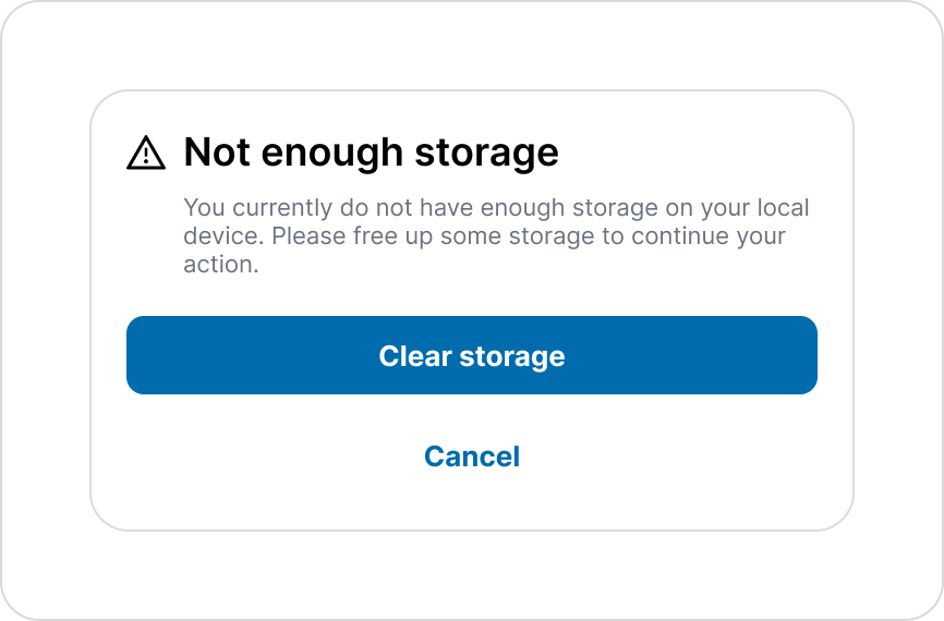
In this example, we have a well structured feedback. The title immediately tells the user what is happening. The text clearly explains the situation and tells the user what they can do next.
We also have two clear CTA's: "Clear storage" and "Cancel". This gives the user clear options and let's them decide how they want to proceed.
With properly structured feedback, we can reduce confusion, support users throughout their journey, and help them reach their goal.
Design for understanding, not guessing
Good UX isn't about making users think harder. It's about designing the interface so they don't have to put too much effort to think.
Affordances show users what is possible.
Signifiers show them where and how to act.
Constraints prevent unwanted actions.
Mapping makes the relationship between an action and its result predictable.
Feedback tells users what happened and what to do next.
When these principles work together, the interface becomes easier to understand and navigate. Users spend less time figuring out how the product works and more time accomplishing what they came to do.
And that's ultimately what good discoverability is about: making the right action easier to see, understand, and complete it.
Enjoyed this article?
Let's work together.
Give me a call, send an email, or reach out directly on LinkedIn, whichever works best for you.